Puma City: A Traveling Modular Store from Shipping Containers
LOT-EK, a mindful and artistic architecture firm in New York, used 24 refurbished shipping containers to create Puma City. The 11,000-square-foot moveable retail and event space that has travelled around the world via the established cargo shipping network.
The building is fully dismountable and included all the necessary elements to meet international building codes, such as plug-in electric, climate consideration, and HVAC system, and it retains ease of assembly and operation.
The structure of the store and the nature of the containers really seems to fit the Puma brand—modern and inventive with industrial respect.
***
Christian Schaller's Transformer Apartment: Living in 258 Square Feet
Barcelona-based photographer Christian Schaller's rooftop apartment crams six rooms into 258 square feet. Like the Hong Kong Efficiency Apartment Tori shared a ways back, Christian's bathroom, kitchen, living room, bedroom, dining room and porch emerge when needed from cupboards, cabinets and compartments. The kitchen unfolds from the wall, the bed/couch emerge from under the porch and various other amenities pop and swivel out from their nesting places.
***
Hong Kong Apartment Design Efficiency To The Max!
In Hong Kong, because of the space, apartments are small and expensive. Gary Chang, an architect, decided to design a 344 sq. ft. apartment to be able to change into 24 different designs, all by just sliding panels and walls.
***
A 1972 Airstream Gets a Modern Makeover from Hofmann Architecture
This clean and modern update to a classic 1972 Tradewind Airstream trailer is the work of 28-year-old Matthew Hofmann of Hofmann Architecture. Now the soon-to-be forty trailer looks like an edgy guest studio that could make the front page of Air BnB.
He says Airstream remodels are gaining popularity because they're flexible enough to appeal to all ages, economic statuses and lifestyles. They can be beautiful studio spaces or eclectic guest houses and then can roll away on surfing trips or outback safaris.
His latest client requested a small sustainable space and comfortable guesthouse that would be durable enough to withstand a little wear from her ranch, cowboy boots and a small heard of rottweilers.
"I wanted this to be a place where my guests felt comfortable and not worry about staining the carpet," said the client.
***
The Surf Shack: A Modern Beach Retreat from an Old Shipping Container
Hartman Kable created the
Surf Shack as a place to crash during his weekend retreats to surf the Washington Coast (which can be a bit cold and breezy to camp).
***
Twisted Condos: Architecture Design and Photography
The architecture design of the
Absolute Condos at Mississauga, Ontario, features beautiful twists and light-reflecting curves. Jay Mitchosky captured the building's forms in these fantastic photos he shared at
his blog.
***
The Up House in Real Life: Architecture Design Inspired by Film
Disney made Blair Bangerter's dreams come true. The strict disciples of intelectual rights rarely grant permission for works spun off of their creations, but luckily (and surprisingly) they granted him permission to build a reproduction of the cute and colorful victorian home that costars in Up.
***
The Eyelid House
***
Tokyo Home - Yasuhiro Yamashita
***
Tartu Rebase Street
***
Year 1 - Tom Crawshaw
***
Neither Here Nor There - Alex Perez
***
Rustic Backyard Micro Home
***
La Cornette - Yh2
***
Hirschkron / Camacho Terrace
New York, NY
Completed May 2008
Serving as the exterior extension to the bedroom, the penthouse terrace was conceived as a weaving of horizontal
surfaces while also keeping to the soft transition curves as mirrored in the bathroom fitted glass wall.
new photos by Dean Kaufman
***
Hotel Tierra Atacama
***
Tower House - Mimosa
***
Siglap House - Aamer Architects
(LOVE THIS)
***
Wherever Le Corbusier lays his hut...
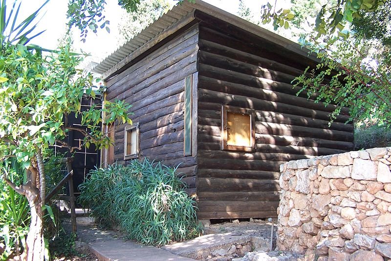
The only building the modernist master made for himself was a primitive log cabin – the inside was pretty impressive though
Le Corbusier - Cabanon
Shedworking's Garden Shows correspondent
Emma Townshend recently visited Le Corbusier's marvellous shedworking structure in France and sent us back some photos. "You walk down a little footpath with cactuses by the sea to get to it," she writes.
"There's also a gorgeous little bar there - next door, owned by a friend who was a plumber = so they didn't have to cook. They show you lovely pictures of the interior when Le Corbusier lived there, when his wife slightly disturbed the minimalist interior by draping everything in very French tablecloths. The most amazing thing is how everything folds away into a little cabinet of some kind. And these little windows at all different elevations which light out onto different parts of the amazing sea view."

"There's also a gorgeous little bar there - next door, owned by a friend who was a plumber = so they didn't have to cook. They show you lovely pictures of the interior when Le Corbusier lived there, when his wife slightly disturbed the minimalist interior by draping everything in very French tablecloths. The most amazing thing is how everything folds away into a little cabinet of some kind. And these little windows at all different elevations which light out onto different parts of the amazing sea view."
It's also an early eco-shed since there's plenty of recycling going on such as crates standing in for chairs. He also built a smaller shedworking atmosphere nearby to really work in. There's a particular good article about the Cabanon at the Twentieth Century Society site and the Cabanon is open to the public, organised by La Commune de Roquebrune-Cap Martin, Office du Tourisme, 218 avenue Aristide-Briand
***
***
Atelier
Render 1-2
The Vision
Atelier set out with the intention of creating an entirely new space for the garden: Garden Studios
To create a shield from the elements that connects the user to their environment in a way not facilitated by the traditional summerhouse, log cabin or garden cube.
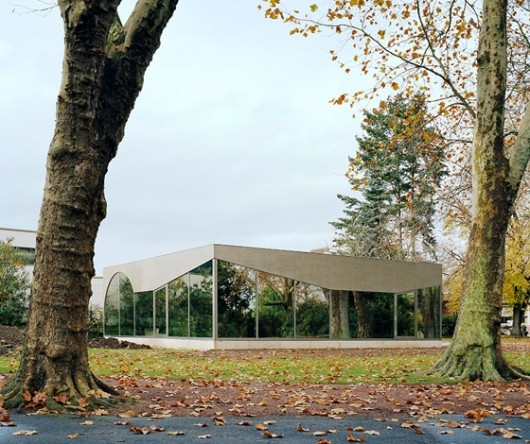
The entire roof of our garden studios seemingly cantilevers over the entire structure but is actually supported by the slenderest of stainless steel columns. The thin slivers of glass that run around the perimeter of the side walls reinforce the feeling that the roof is floating over the structure.
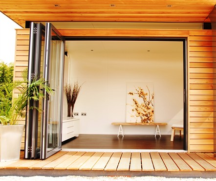
Using high level glazing allows the Atelier' garden studios to cheat as much light as possible whilst maintaining the privacy of the occupants. Opening up the sliding, folding doors and sitting inside, protected from the elements, really brings the outside in.
A key design feature of the Atelier garden studio and office range is the curve. Curves are tricky to master, but when they are achieved nobody can argue their beauty.
The defining principle of Atelier is modularity. Our garden offices are designed to fulfilyour myriad individual requirements by reconfiguring common elements.
Customisation and modularity are not mutually exclusive – quite the contrary. You have a choice of exterior cladding, interior finishes, doors as well as the option to add elements such as solar panels, parallel opening windows, under floor heating etc.
***


